A week with Tailwind CSS
Close to a decade after everyone else, I finally tried my hand at Tailwind CSS. I found some good ideas, some bad ones, and a surprise or two.
Published December 19 2023
Close to a decade after everyone else, I finally tried my hand at Tailwind CSS. I found some good ideas, some bad ones, and a surprise or two.
Published December 19 2023
Let’s just get it out of the way: Congratulations! Welcome to the party, etc. Yes, Tailwind CSS is old, but the future is, as we know, unevenly distributed.
Today, we launched a static page to replace an older service, Smilefjesplakater online. Since the solution is small, we saw it as a good opportunity to take a minor technical risk and learn something new. So we decided to build the interface using Tailwind CSS, even though none of us had used it before.
Tailwind is a CSS framework. Ideally, you don’t write any CSS yourself, but
instead use Tailwind’s utility
classes, such as py-8 (8 units of
vertical padding, i.e. top and bottom), hover:text-bold (bold text on hover),
flex (display flex), etc. It’s almost inline CSS, but with class names —
which gives you access to media queries, pseudo-classes, etc. In addition to a
huge library of such classes, Tailwind includes a build system that gives you a
CSS file with only the utilities you actually use.
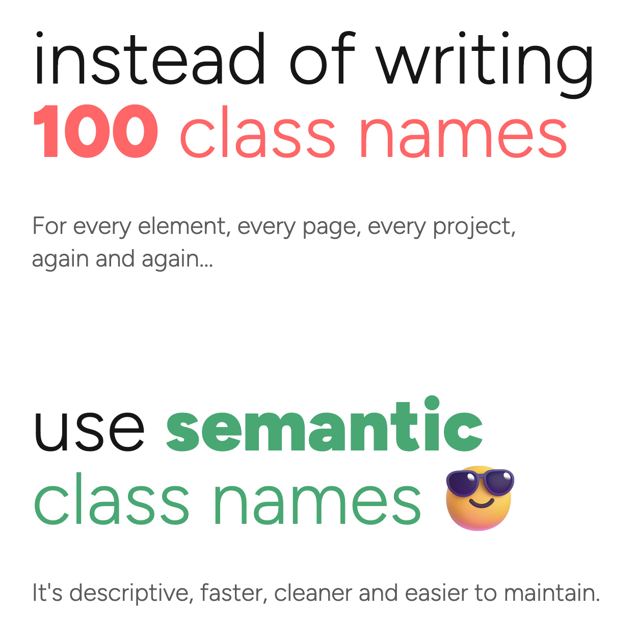
Nicole Sullivan’s OOCSS taught me to love utility classes over 10 years ago, so not having to write them manually all the time was an attractive proposition.
Tailwind charmed from the start. Even though I asked it to watch some Clojure files (which I doubted it would understand), the build process never once let me down — it always did what I wanted, and more. It’s fast, and once started, you just forget about it. 👍
Tailwind has a system for generating utilities with and without various modifiers — a highly efficient tool for building layouts. I recently did a mobile adaptation of a page, which illustrates this strength well.
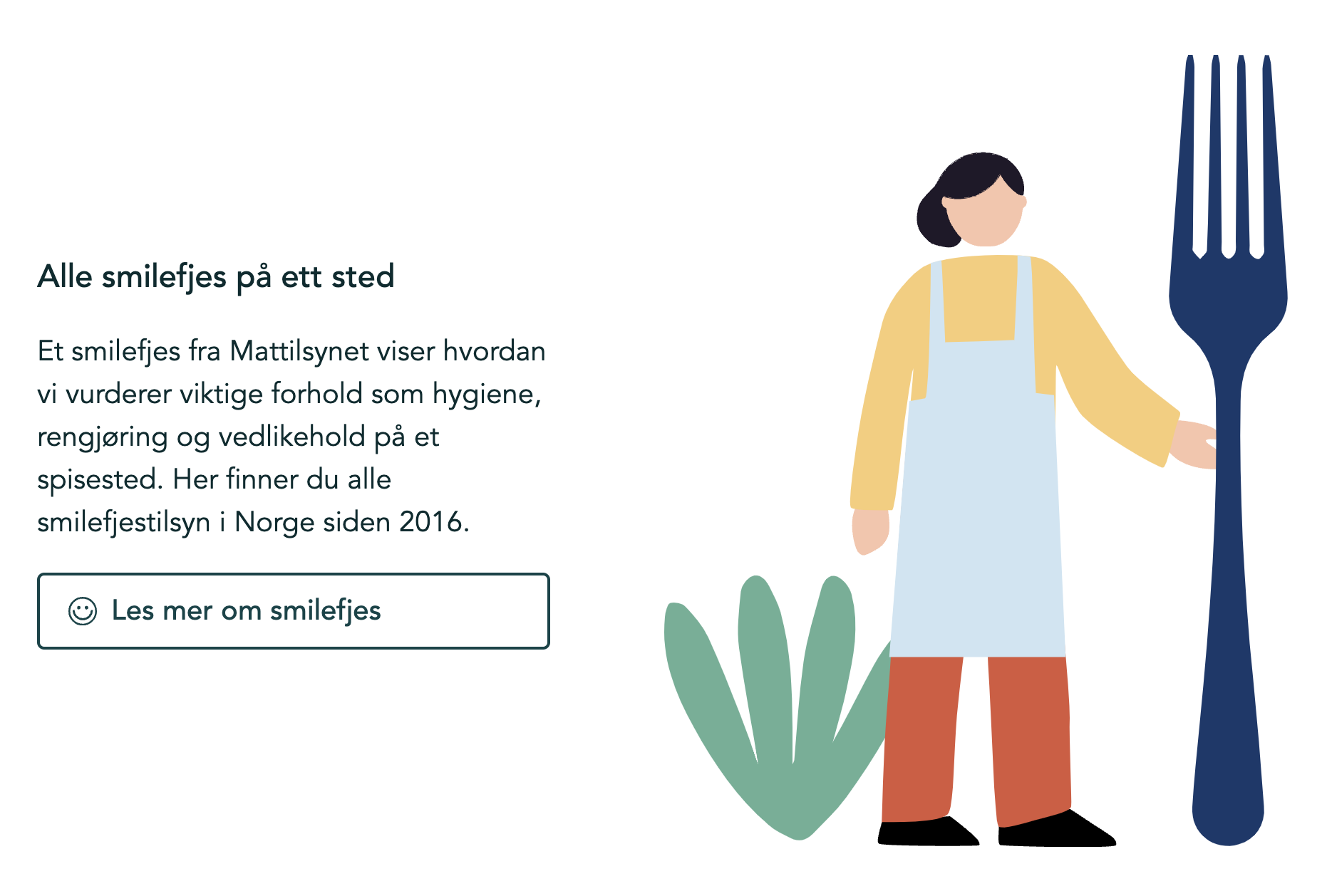
We started with this markup (expressed using Clojure data structures, also known as hiccup):
[:div.flex.px-8.py-4
 [:div.max-w-72.py-4
  [:h2.text-lg.font-medium.mb-4
   "Alle smilefjes på ett sted"]
  [:p.mb-4
   "Et smilefjes fra Mattilsynet viser hvordan
    vi vurderer viktige forhold som hygiene,
    rengjøring og vedlikehold på et spisested."]
  (icon-button
   {:icon icons/smilefjes
    :href "https://www.mattilsynet.no/mat-og-drikke/forbrukere/smilefjesordningen"}
   "Les mer om smilefjes")]
 [:div.max-w-full.py-4.w-full
  [:div.md:pl-16 (svg "/images/inspektør.svg")]]]
The key point here is that the outer div has flex so the two inner divs
are displayed side by side:
This doesn’t work so well on small screens. I needed to drop flex on small
screens and redistribute the padding a bit so things didn’t end up crammed
together. And I did that as follows:
flex on the container became md:flex, which means: apply flex starting
from the predefined
breakpoint md.p-8 on the container was replaced with px-8 and py-4. That keeps the
same horizontal padding, but halves the vertical.py-4 on the two inner elements provides the same spacing on large screens,
and also gives suitable vertical padding between the elements on smaller
screens.md:pl-16 on the SVG illustration, so it has left padding when it sits side
by side with the text.The whole task took me five minutes and was a real pleasure. Every possible utility “already exists” — you just use them. Tailwind makes sure that the CSS file only contains what’s actually used. The result:

As you can see hinted at above, Tailwind has a very nice system for spacing, and also for colors.
Because Tailwind’s building blocks are so atomic, things quickly pile up when you’re building more complex components. Just look at this example — can you tell what it is?
[:a
 {:href "https://www.mattilsynet.no/mat-og-drikke/forbrukere/smilefjesordningen"
  :class ["flex" "items-center" "border" "rounded"
          "px-4" "py-2" "font-medium" "border-granskog-800"
          "border-2" "text-granskog-800"]}
 [:div.w-4.mr-2 icons/smilefjes]
 "Les mer om smilefjes"]
It’s a button — a fact that easily drowns in the visual clutter.
If you want to have two buttons in your codebase, you’re more or less forced to either extract this into a function, or forever live with small inconsistencies between your buttons. Keeping that class list identical in multiple places gets messy fast — and this is a fairly innocent example; hardened Tailwind users have seen much worse.
I mentioned the spacing and color systems earlier. The color system is good, but
perhaps not in the way Tailwind encourages you to use it. It assumes you’ll call
a blue spade “blue”, and use class names like border-blue-100. Imagine you
have 1000 such classes across your codebase, and then the designer comes in with
a new theme. Ouch.
Tailwind does allow you to define your own colors, and the issue above is
trivially solved by giving those colors more “semantic” names, so instead you
can write border-primary-100.
Tailwind claims that semantic CSS doesn’t scale. At the same time, there are Tailwind plugins/component systems like DaisyUI that market themselves like this:
When these two tools seem to have such conflicting views on semantics, I suspect
they’re talking about different kinds of semantics. The semantics Tailwind wants
to eliminate are class names like .book-search and .shopping-cart — i.e. CSS
classes named after your business domain. DaisyUI’s semantics are about UI
components — things like buttons, tabs, and
links.
Finding the right domain is as hard as it is important — feel free to check out my talk for more on that topic.
As expected, our first implementation using Tailwind turned into a bit of a mess. But we’ve learned a lot, and we now have a clear idea of how we want to use it moving forward.
I probably won’t base an entire site solely on Tailwind again. For my taste, it
ends up being too much detail and too low a level of abstraction. It has to be
combined with a component library — I need to be able to call a button a btn.
Personally, I believe in something that plays well with Tailwind, like DaisyUI.
That’ll be the next adventure.

