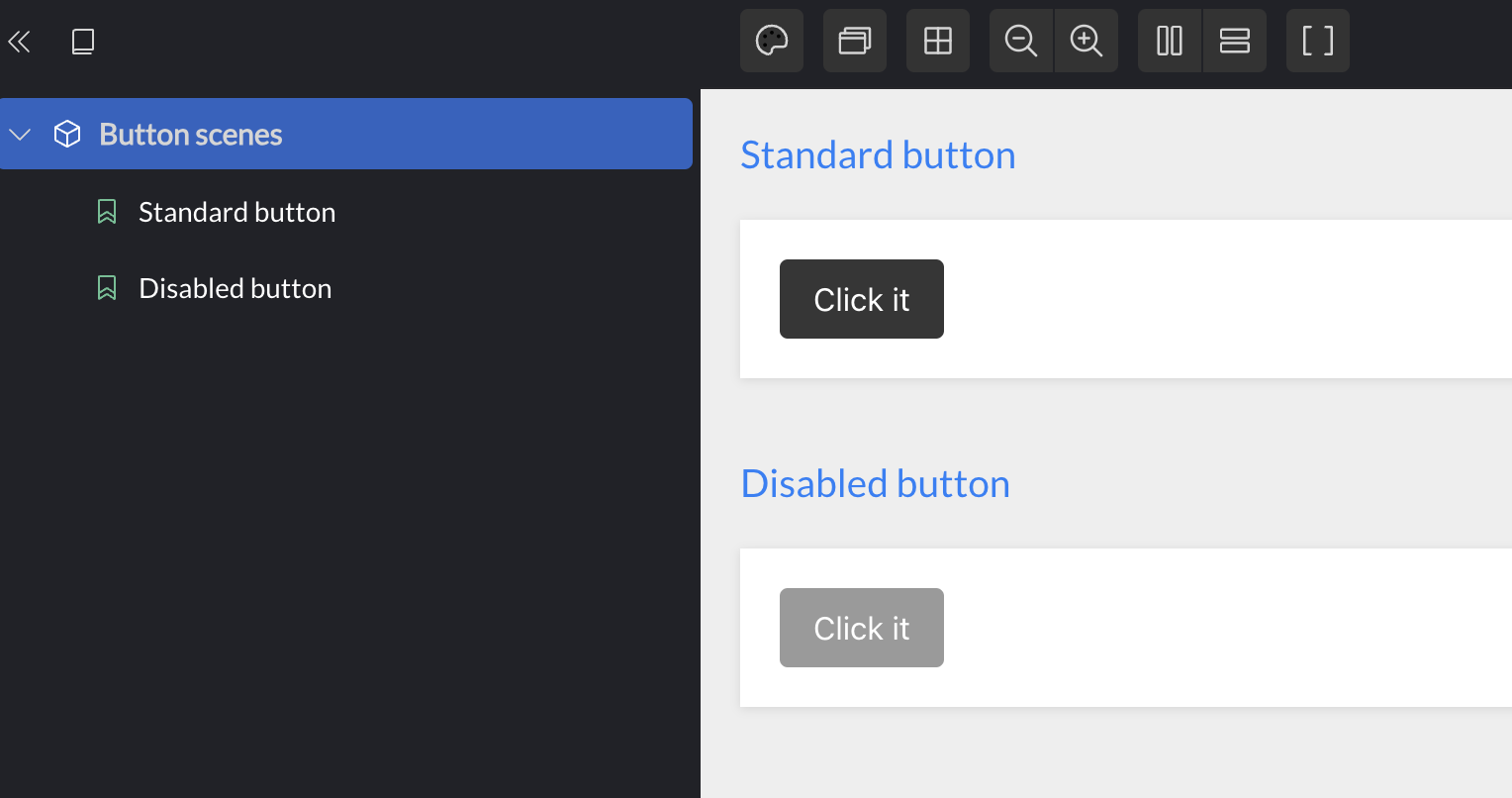
Stateless, data-driven UIs

Frontend development is hard, as demonstrated well by Abhinav Omprakash's article on the subject. His example is particularly interesting, because it's relatively small, yet contains non-trivial data-flows that can easily trip you up. In this article I'll demonstrate how I would solve the same use case by following the principles in my 2023 JavaZone talk Stateless, data-driven UIs.

Published September 17 2023

I recommend reading Abhinav's article to fully understand the example, but for those of you who haven't, here's what we're making: A single page that contains a form. The form has a single date input field with format validation, as well as a compound field consisting of two date inputs that have additional validation for the pair of inputs. Finally there's a button that should only be enabled when the entire form is valid.

In summary: there are several pieces of state, and more than one component need to access the same state.

All code is available on Github.

The source of complexity

Just as in backend development, the main source of (incidental) complexity in frontend development is tight coupling. The Component has become a popular building block, to the extent that many developers put almost all their code inside components, and assemble apps from component trees. Personally, I don't think this is a good approach, because it doesn't separate any concerns - they all mingle in the component.

In my world, the component is a visual building block. It does not manage state, and it does not have behavior. It takes data, and renders a corresponding visual snapshot.

The UI building blocks

Implementing the visual building blocks is a good place to start. To do this, I install Portfolio, and use it to enumerate the visual states I need.

Button

Let's start with the button. It has only two visual states: enabled or disabled. The component follows:

(ns form-app.ui.button
  (:require [dumdom.core :as d]))

(d/defcomponent Button [{:keys [class text enabled?]}]
  [:button {:class (cond-> [:button :is-dark]
                     (keyword? class) (conj class)
                     (coll? class) (concat class))
            :disabled (false? enabled?)}
   text])

The classes come from Bulma, which was also used in the original article. Note that there are no event handlers yet - we'll get back to that.

Here are the two states displayed in Portfolio:

Button visualized in Portfolio

Date input

The date input component can display a placeholder, the user's input value, and optionally an error message:

(ns form-app.ui.date-input
  (:require [dumdom.core :as d]))

(d/defcomponent DateInput [props]
  [:div {:class (:class props)}
   [:input {:class [:input (when (:error? props)
                             :is-danger)]
            :type "text"
            :value (:value props)
            :placeholder (:placeholder props)}]
   (when (:message props)
     [:p {:class [:help (when (:error? props) :is-danger)]}
      (:message props)])])

I made a few tweaks to this component compared to the one in Abhinav's article. First, I removed margins from the component, and instead allowed consumers to pass in classes to use for the container element. This makes the component more reusable by giving the consumer control over spacing in the layout the component is used in. Second, I separated the message under the field from the error state. A message can be used also for non-error information, as illustrated by the Portfolio visualization:

Date input visualized in Portfolio

Date range input

The date range input just displays two date inputs in a flex layout, with an optional error message. In the original example both inputs would display an error if the end date was not after the start date. With an option for a range-level error message we can display this message only once instead.

(ns form-app.ui.date-range-input
  (:require [dumdom.core :as d]
            [form-app.ui.date-input :refer [DateInput]]))

(d/defcomponent DateRangeInput [{:keys [class from to message error?]}]
  [:div {:class class}
   [:div {:class [:is-flex :is-align-items-center]}
    [:p {:class :pr-3} (:label from)]
    [:span {:class :pr-3}
     (DateInput from)]
    [:p {:class [:px-3]} (:label to)]
    (DateInput to)]
   (when message
     [:p {:class [:help (when error? :is-danger)]}
      message])])

Here are a couple of examples from Portfolio:

Date range input visualized in Portfolio

Date form

The final component is the full form that combines all the elements, and adds some spacing by way of classes like :my-3 (vertical margin - e.g. y axis):

(ns form-app.ui.date-form
  (:require [form-app.ui.button :refer [Button]]
            [form-app.ui.date-input :refer [DateInput]]
            [form-app.ui.date-range-input :refer [DateRangeInput]]
            [dumdom.core :as d]))

(d/defcomponent DateForm [{:keys [date-field date-range button]}]
  [:div {:class [:container :my-6]}
   (DateInput (assoc date-field :class :my-3))
   (DateRangeInput (assoc date-range :class :my-6))
   (Button (assoc button :class :my-3))])

Here's a visual example:

Date form visualized in Portfolio

And that's really all there is to the components. So far very little complexity. The components codify the visual building blocks, and can be freely reused. We'll need to pair them with some state management and logic to create something interesting.

State management

For state management we will have a single global atom. Any change to the data it contains will cause a render. This yields a straight forward data flow and enables loose coupling along many axes - see my talk for more details.

The global store will contain "business domain data", but the generic UI components only know about generic UI data. To bridge this gap we will use a function that translates from one domain to the other. The resulting render function looks like this:

(ns form-app.core
  (:require [dumdom.core :as d]
            [form-app.form :as form]
            [form-app.ui.date-form :refer [DateForm]]))

(defn render [element state]
  (d/render
   (DateForm (form/prepare-ui-data state))
   element))

(defn start [store element]
  (add-watch store ::app
    (fn [_ _ _ state]
      (render element state)))
  (render element @store))

The form/prepare-ui-data function is where all the interesting logic is. Luckily, this is a pure function that can be tested extensively. Let's have a look at what it does.

Preparing UI data

The top-level prepare-ui-data function leans on three other functions:

(defn prepare-ui-data [state]
  {:date-field (prepare-date-field state)
   :date-range (prepare-date-range state)
   :button (prepare-button state)})

The important part is that it includes the keys that the DateForm component expects.

The prepare-date-field function is a bit more interesting. It will lean on some data in the store that looks like this:

(def state
  {:field/date-field
   {:value "2023"
    :validating? true}})

:field/date-field is the unique id of the specific field. :value is whatever the user has typed in so far. :validating? is used to control whether validation is active or not. We don't want to nag the user with validation errors as they're typing, so this flag can be used to hold off on validation until the user blurs the input field the first time.

(defn prepare-date-input [state k]
  (let [{:keys [value validating?]} (k state)
        message (when validating?
                  (validate-date value))]
    (cond-> {:placeholder "YYYY-MM-DD"
             :value (or value "")}
      message
      (assoc :message message
             :error? (boolean message)))))

(defn prepare-date-field [state]
  (prepare-date-input state :fields/date))

prepare-date-field delegates to a function that prepares any date input - this way we don't have to hardcode the field id, and we can use the function to prepare the date inputs in the range as well.

If we're in validating mode, we perform the validation. If that produces a message, we also mark the field as errored. Previously this idea that a message always means error was encoded in the component. Now it's instead encoded in a very specific use of the component. We can even write tests to ensure that this behaves as desired:

(deftest prepare-date-field-test
  (testing "Prepares field with placeholder"
    (is (= (sut/prepare-date-input {} :field)
           {:placeholder "YYYY-MM-DD"
            :value ""})))

  (testing "Displays validation message when in validating state"
    (is (= (sut/prepare-date-input
             {:field {:value "2023"
                      :validating? true}} :field)
           {:placeholder "YYYY-MM-DD"
            :value "2023"
            :message "Incorrect date format, please use YYYY-MM-DD"
            :error? true})))
  ,,,
)

Handling events

So far we have not handled any events. We will use data to drive events. dumdom, the rendering library we're using supports a global event handler. Whenever it encounters an event attribute, such as on-click that is not a function, the value is instead passed to the global event handler.

First, let's add event capabilities to the DateInput component:

(d/defcomponent DateInput [props]
  [:div {:class (:class props)}
   [:input {:class [:input (when (:error? props)
                             :is-danger)]
            :type "text"
            :value (:value props)
            :placeholder (:placeholder props)
            :on-input (:input-actions props)
            :on-blur (:blur-actions props)}]
   (when (:message props)
     [:p {:class [:help (when (:error? props)
                          :is-danger)]}
      (:message props)])])

And here's an example of what the events look like:

(testing "Includes current value"
  (is (= (sut/prepare-date-input {:field {:value "2023"}} :field)
         {:placeholder "YYYY-MM-DD"
          :value "2023"
          :blur-actions [[:action/save [:field :validating?] true]]})))

In other words - when the user blurs a field after typing in it, set the field's :validating? flag in the global store to true. That will cause a new render, and prepare-input-field will produce an error message that will eventually be rendered on screen.

This is how to wire this up in dumdom:

(ns form-app.core
  (:require [dumdom.core :as d]
            [form-app.form :as form]
            [form-app.ui.date-form :refer [DateForm]]))

(defn execute-actions [store actions]
  (doseq [[action & args] actions]
    (apply prn 'Execute action args)
    (case action
      :action/save (apply swap! store assoc-in args))))

(defn register-actions [store]
  (d/set-event-handler!
   (fn [e actions]
     (execute-actions store actions))))

(defn start [store element]
  (register-actions store)
  ,,,)

If you wanted to, you could add more indirection and dispatch from execute-actions, but I find the compact directness of this code to be a strength. The actions are loosely coupled from the UI by way of register-actions, and that's good enough for me.

Event data

Input events are most interesting for the data they carry: they provide access to the user's input. However, that information isn't available until the event fires. Since we're using data, we'll have to access that information with late binding. We can use a placeholder in the action data that will be replaced by the actual value when the event triggers. Like this:

(testing "Prepares field with placeholder"
  (is (= (sut/prepare-date-input {} :field)
         {:placeholder "YYYY-MM-DD"
          :value ""
          :input-actions [[:action/save [:field :value] :event/target.value]]})))

And then we will need to fix our wiring to make sure that :event/target.value is replaced with the actual target value:

(ns form-app.core
  (:require [clojure.walk :as walk]
            [dumdom.core :as d]
            [form-app.form :as form]
            [form-app.ui.date-form :refer [DateForm]]))

(defn execute-actions [store actions]
  ,,,)

(defn register-actions [store]
  (d/set-event-handler!
   (fn [e actions]
     (->> actions
          (walk/postwalk
           (fn [x]
             (if (= :event/target.value x)
               (some-> e .-target .-value)
               x)))
          (execute-actions store)))))

clojure.walk/postwalk ships with Clojure and provides a snappy solution to our problem. This will only happen when events trigger, and on very small datasets, and will be plenty fast.

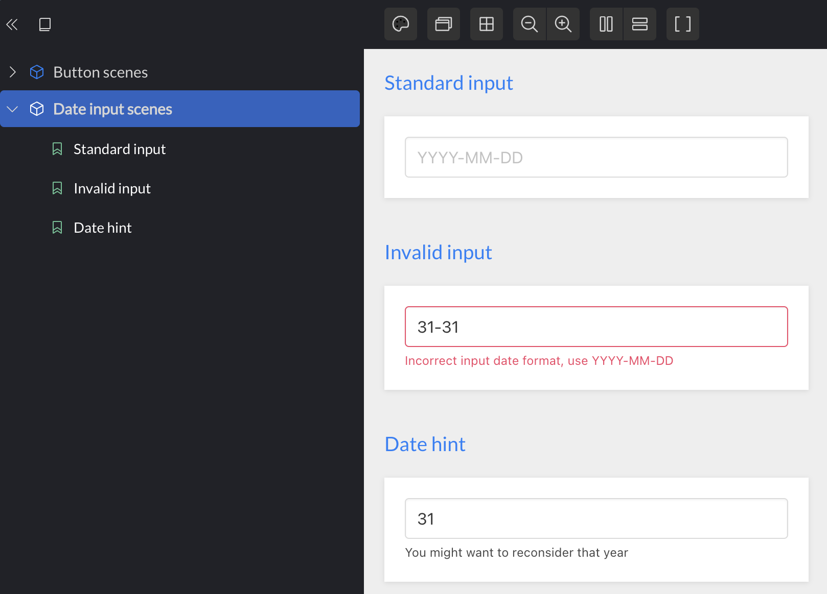
Preparing date inputs

Now we're ready to review the entire prepare-date-input function:

(defn prepare-date-input [state k]
  (let [{:keys [value validating?]} (k state)
        message (when validating?
                  (validate-date value))]
    (cond-> {:placeholder "YYYY-MM-DD"
             :value (or value "")
             :input-actions
             (->> [[:action/save [k :value] :event/target.value]
                   (when (and validating?
                              (or (empty? value) (not message)))
                     [:action/save [k :validating?] false])]
                  (remove nil?))}
      message
      (assoc :message message
             :error? (boolean message))

      (and (not validating?) value)
      (assoc :blur-actions [[:action/save [k :validating?] true]]))))

I left out the validations, as the specifics are not interesting, but you can read all the code on github.

This function captures all the interesting behavior for the field: It does not validate as the user types. When the field is blurred, an error is displayed if necessary. The error will be cleared immediately - as the user types - and when it has been cleared, no new error will be produced until the next blur. This is tricky stuff to get right, but there are a bunch of tests, and those are easy to write, since it's just a plain old pure function.

Preparing the button

The rest of the functions to prepare UI data are quite similar. Because all of them have access to the same global state, it is not a big problem that multiple components need to work on data from several fields. As an example, consider how we prepare the button, which should only be clickable when all fields are valid:

(defn prepare-button [state]
  (let [ready? (and (valid-date-format?
                     (get-in state [:fields/date :value]))

                    (valid-range?
                     (get-in state [:fields/range-from :value])
                     (get-in state [:fields/range-to :value])))]
    {:text "Submit"
     :enabled? ready?
     :actions (when ready?
                [[:action/save [:fields/date] nil]
                 [:action/save [:fields/range-from] nil]
                 [:action/save [:fields/range-to] nil]])}))

Conclusion

You can review the code in full on github. It has very little machinery - the core namespace is 30 lines of code, and the rest is pure functions and generic UI components. Because we've separated the concerns, there is not a lot ofincidental complexity, and the code is both highly testable and largely reusable. I've used this basic approach for 10 years, and have had great success with it -- it truly scales and works as well in big code bases as it does in small ones.