Zero downtime Kubernetes deployments
A prerequisite for hitting the mark with software design is having good control over the domain you operate in. But what exactly is the domain of your frontend code?
Published January 11 2023
A prerequisite for hitting the mark with software design is having good control over the domain you operate in. But what exactly is the domain of your frontend code?
Published January 11 2023
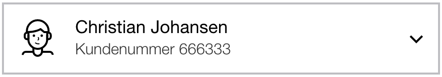
Recently I sat down to implement an account selection component, which looks like this:
It was supposed to be straightforward since we already implemented this component:
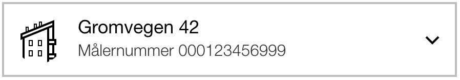
When I pulled up the usage examples of the latter, I realized this would be a bit less straightforward than I initially thought:
(FacilityToggler
 {:selected {:street-address "Gromvegen 42"
             :meter-label "Målernummer 000123456999"
             :icon :ui.icons/apartment
             :actions []}})
If I’m going to reuse this component, I have to send the user’s name as
:street-address and the customer number as :meter-label. Face, meet palm.
This FacilityToggler turns out to have a few more tricks up its sleeve:
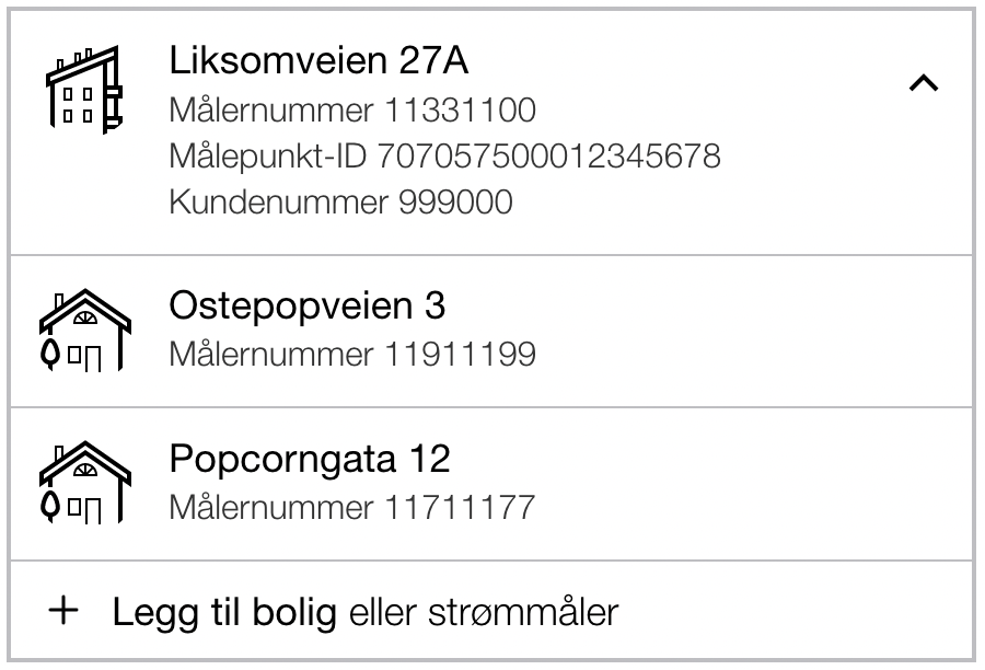
In other words, it can be expanded. Then it shows more details about the selected facility, other facilities you can choose from, and even an option to add a facility. These things are also relevant for the new account selector I’ve been tasked with creating. Unfortunately, the code looks like this:
(FacilityToggler
 {:selected {:street-address "Pretend Street 27A"
             :meter-label "Meter Number 11331100"
             :meter-point-id "Meter Point ID 707057500012345678"
             :customer-id-label "Customer Number 999000"
             :icon :ui.icons/apartment
             :actions []}
  :options [{:street-address "Cheese Pop Road 3"
             :meter-label "Meter Number 11911199"
             :icon :ui.icons/house
             :actions []}
            {:street-address "Popcorn Street 12"
             :meter-label "Meter Number 11711177"
             :icon :ui.icons/house
             :actions []}]
  :actions [{:icon :ui.icons/bare_plus
             :title "Add residence"
             :text "or electricity meter"}]})
The implementation speaks the wrong language because it operates in the wrong domain. In the rendering part of the code, it is not the app’s domain model that applies. For a user interface, concepts like “street-address”, “meter-label”, “meter-point-id”, and other backend model terms are completely meaningless. What does a street address even look like?
Good abstractions in frontend code talk about visual concepts and interactions, not textual content. To understand why this is, let’s reflect on what these different terms can tell us about what’s going on.
The component in the example above originates from the energy domain. In the backend, it’s very helpful to know that a customer can only see consumption data for a facility/home during periods where they have an active contract for it. These terms help me understand the code and form the basis for good abstractions that ease further work.
In the user interface, none of these terms help me because none of them have any inherent visual representation. Nor do they represent user interaction in any way.
In a user interface, we benefit more from concepts like “box”, “button”, “tabs”, “click”, etc. It is irrelevant what a button does or what text is on it when you write CSS so that it matches the design.
Back to our FacilityToggler. Sure, it is used today to select between
facilities, but as we saw with the account selector, a similar component can
serve very different purposes. The solution is not to copy the component and
swap out the terms, but to rewrite the one we have to work for both cases.
Before we start: What is this, if not a FacilityToggler? Well, it’s some kind
of menu. Which can be opened and closed. When you open it, it “drops down” over
the content below. I dare say that DropdownMenu is not a bad name. Once the
component name fits, we’re well on our way. The next step is to find more
generic visual terms for the concrete data points. Here’s what I ended up with:
;; From this:

(FacilityToggler
 {:selected {:street-address "Street 42"
             :meter-label "Målernummer 000123456999"
             :icon :ui.icons/apartment
             :actions []}})

;; ...to this:

(DropdownMenu
 {:selected {:title "Street 42"
             :details ["Målernummer 000123456999"]
             :icon :ui.icons/apartment
             :actions []}})
The domain-specific :street-address has become the more UI-adapted :title. I
hope you would agree that a title is the most eye-catching text on an element.
:meter-label became :details. Text at this level can be tricky to name, and
it could just as well have been :text, :description, or similar. As long as
it is clear that this is less prominent text than a title, and the name does not
point to something domain-specific, we are on the right track.
:icon and :actions (i.e., what happens when the user clicks the menu) were
already aptly named, and don’t need changing.
Sometimes the component may appear on the screen before its data is available. Then it looks like this:
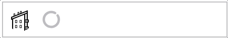
And the code looks like this:
(FacilityToggler {:loading? true})
Can you spot the problem?
The original menu shows an icon adapted to the type of home: house, townhouse, apartment, or cabin. When we’re waiting for data, we don’t know which type it is, so the default is a townhouse. But where is this default? Well, it’s hardcoded inside the component, of course. It probably seems stupid now (and it is), but given that the component was originally meant as a home selector, it’s not entirely unreasonable.
The terms we use influence the code we write, and a too narrow focus often results in a limited scope of use.
As you may remember, the home selector can show several things. When expanded, it shows more details about the home, multiple homes, and even an option to add a home. It looks like this:
(FacilityToggler
 {:selected {:title "Fakestreet 27A"
             :details "Meter number 11331100"
             :meter-point-id "Meter point ID 707057500012345678"
             :customer-id-label "Customer number 999000"
             :icon :ui.icons/apartment
             :actions []}
  :options [{:title "Cheesestreet 3"
             :details "Meter number 11911199"
             :icon :ui.icons/house
             :actions []}
            {:title "Popcorngate 12"
             :details "Meter number 11711177"
             :icon :ui.icons/house
             :actions []}]
  :actions [{:icon :ui.icons/bare_plus
             :title "Add home"
             :text "or electricity meter"}]})
Here, the “actions” have moved inside “options” and gotten a new :icon-size
that handles the small visual difference. It’s also worth noting that all the
domain-specific details from FacilityToggler are now just a list of details.
It hardly matters visually what these are. As long as we know there are multiple
distinct details, we can show them each on their own line, and that’s good
enough.
After this refactoring, the implementation went from 150 to 110 lines of code. That’s almost a one-third reduction in code size while the component became more flexible and usable for more things. That’s often how it goes when our code becomes less specific: there are fewer concrete things to handle, and the more general nature of the new code opens up for broader use.
As you may have guessed from the code examples in this post, DropdownMenu
itself doesn’t do anything to show/hide items in the menu. If you want to show
the menu closed, you only give it :selected. If you want to show it expanded,
you also give it :options. This keeps the component as “dumb” as possible — it
just renders what you give it.
To control the component, I have other functions that prepare a dropdown menu for the user’s accounts or for facilities. It is this code that decides if the menu is open or closed and other details. I can write tests for that without thinking about rendering and all the volatile details that come with it.
Since the component itself doesn’t really distinguish between selected and
options, we could just as well give it one list of options. I could argue
for both solutions. The important point here is that the component does not deal
with domain concepts.
When React came on the scene almost 10 years ago(!), there was a lot of talk about how React lets you express your interface as a function of your data:
fn(data) => vdom
(vdom is “virtual DOM,” meaning what your components describe. React and
similar libraries ensure that the structure is efficiently mirrored in the
actual DOM.)
I would argue that this picture lacks a nuance. If you want a clean frontend made up of reusable components, you should strive for two functions:
domainToUI(data) => uiData
component(uiData) => vdom
Your uiData should not contain a single domain-specific term that does not
directly support the work of building a user interface.
Take a look at your frontend code: How many domain terms do you find in your components? Are they helpful for building a user interface? Or do they just unnecessarily lock certain components to specific functions?

